MultiForm - Input
Overview Input Types
| type | appearance | xml definition |
|---|---|---|
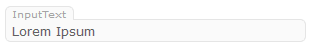
| text | |
|
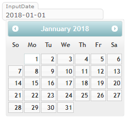
| date | |
|
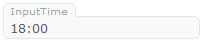
| time | |
|
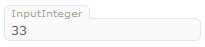
| integer | |
|
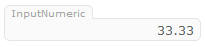
| numeric | |
|
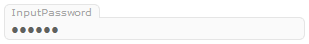
| password | |
|
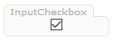
| checkbox | |
|
| textarea | |
|
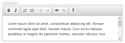
| html | |
| attribute | value | Description |
|---|---|---|
| id | {identifier} | this identifier has to be unique throughout the form and must correspond to the compiled DataObjects property. Note: id's for computed values should be preceeded with an underscore (_) |
| label | {description} | the label displayed in the top left corner of the field |
| type | [text|date|time|integer|numeric|password|checkbox|textarea|html] | input type (see above) |
| width | {width in % or px} | width in percent or pixel |
| align | [left|center|right] | alignment within the input field |
| height | {height in % or px} | height in percent or pixel |
| eval | {ax/js expression} | the result of the evaluation of this expression replaces the value of the formfield whenever the user leaves a formfield or clicks a button |
| evalCond | {ax/js expression} | example: true|false default: true whether or not the eval expression should be run |
| disabled | {ax/js expression} | example: true|false default: false whether or not the formfield is editable |
| format | {AX_ValueConverter} | example: Numeric({"markThousands":true}) AX_ValueConverter with parameter set |